Have you tried Facebook ads only to have your ad rejected because of the image? Or has your ad not converted in the way you had hoped? Typically the image you choose can be the culprit.
The good news is that you don’t have to be a graphic designer to create good images (although, of course, hiring a graphic designer is a great idea) but if you are on a tight budget, you can create something that will both convert and get approved.
Facebook Ad Sizes
The first step is to understand what ad image sizes work for each type of ad. The ad image sizes can change frequently. While there are many good “most recent ad size” charts out there, the best way to know for sure is to check with Facebook directly.
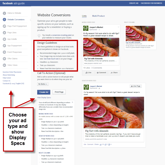
They have a resource on their Facebook Ads Guide where you can see how all the ads will appear based on your objective and get the details on how many characters are in the copy, whether or not you can add a call-to-action button, and what the display specs are for each type of ad.
You can then use the Design Guidelines to tell you which image size is best but then you can also show the Display Specs to give you an idea of how the image will appear based on the placement of the ad.
Click on each type of ad on the left sidebar to get information about each ad design.
The ads I use the most have image sizes as follows:
- Clicks to Website or Website Conversion Ad: 1200 x 628 pixel image
- Page Likes Ad: 1200 x 444 pixel image
- Page Post Engagement Ad: 1200 pixels wide with a 4:3 ratio so that would be 1200 x 900 pixels
- Event Responses Ad: 1200 x 444 pixel image
So once you know the size image you want, now you have to design the image.
Maximum 20% Text in a Facebook Ad Image
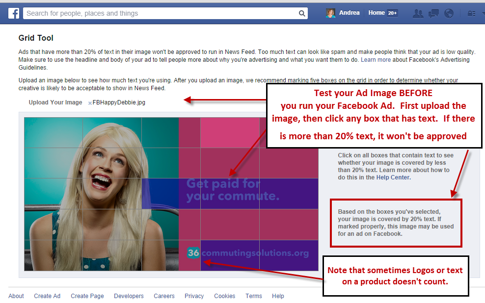
Your first consideration is that you can only have a maximum of 20% text in the image itself. So if you want to Boost or Promote a Post that automatically brings in a image from a link that has too much text in it, you won’t be able to.
And what constitutes 20% text is calculated strangely. You must use the Facebook Text Overly tool found here: https://www.facebook.com/ads/tools/text_overlay
Once you go there, upload your image and click on the boxes that have text in them. The grid they use is always 5×5 no matter what the dimensions of your ad image are and you can have a maximum of 5 boxes checked that have text in them.
You may need to re-position your text so that it does not overlap into one of the other boxes but sometimes the final design can be less than ideal. Note that logos or text that appears on a product sometimes doesn’t count. But sometimes it does. Facebook is a little flaky like that and the ad review and approval can be different depending on how it’s conducted in Facebook.
Use a Design Tool
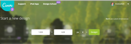
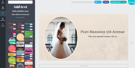
There are lots of different ways to design and image on a budget. My favorite tool by far for Facebook Ad design is Canva.
You can start with the custom dimensions of the ad and then add text, frames, backgrounds, and other cool features to make your ad pop.
Canva is not the only design tool that works well. You can use Picmonkey or even PowerPoint to design great graphics and size them according to what you need.
Once you have the great graphic, upload it to the Text Overlay tool to make sure that there is only 20% maximum text. Make any adjustments needed and then re-test. Now when you set up your ad, you know it will be approved because you have tested it yourself.
Hope that helps and make sure you check out my other posts on Facebook Advertising. I also have a great course called Facebook Advertising Secrets. Let me know how your Facebook Ad campaigns are going in the comments below!








Great post Andrea!! I’ve been caught with the 20% text rule before, because my logo was considered text. I learned the hard way to test, test test.
I so needed this article last week when I asked about the size requirement for FB ads. This is great stuff to have handy. Thanks you. Now here I go off to share it 😀